


It's finally arrived! The impact of mobile -- proclaimed since Y2K -- is now actually influencing marketing decisions. So much so that as we build web properties for our clients, a regular question arises: Do we need an app for that?
For the first time, smartphone sales will eclipse mobile phone sales. More than 500 million smartphones are expected to sell this year versus 400 million cell phones. Compare that with the global estimated sales of 100 to 150 million PCs and you quickly realize that smartphones may soon be the only way a majority of your prospects have to "browse" your product or service offering.
As we work on mobile strategies for clients, many are surprised that we don't automatically suggest a mobile app. Instead, we consider: mobile app versus mobile website?
While the answer certainly can be and is oftentimes both, you may consider starting with a mobile website first. We know apps are cooler, but let's face it; we all have our wares to sell. So the bottom-line trumps "cool."
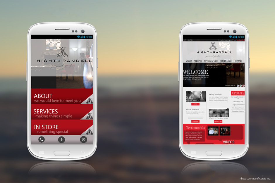
We followed our own advice and launched our mobile website in 2010. Today, Innis Maggiore announces the launch of its Positioning App in the Droid Marketplace, iTunes (iPhone/iPad) and Amazon Marketplace.
The primary reasons we started with a mobile website first, and recommend the same to most clients, are many:
1) It's typically cheaper. One of the easiest ways to get going with a mobile website is to simply provide a mobile design using the content from your existing site. Not only is it easier to implement, maintenance is easier since any change made to your website will be reflected in your mobile website. Outside of designing an appropriate mobile interface (see tips below), the content already exists. Apps can be much more expensive to develop and you have to program one for every mobile platform (e.g., iPhone, Android, Blackberry).
2) The reach is greater. As of March 2011, comScore reported that 38.6 percent of smartphone owners used a mobile browser. Compare that to 37.3 percent of owners who downloaded an app, of which iPhone only represents 25.5 percent, a net of less than 10 percent of all smartphone users. Even if you also create an Android version of your app, you would only push that total to 30 percent of smartphone owners.
3) Apps have to be marketed. App clutter is astounding and accelerating quickly. Downloading an app requires a user to perform multiple actions. Attrition is common depending on what personal data is gathered or what registration is required. On the other hand, consider the delight when a prospect visits your site in a mobile browser and finds it already mobile-optimized.
4) Browser-based (mobile design) is the trend for apps. "Hybrid" apps are already in the market (e.g., Bank of America and Facebook iPad apps) where the bulk of the app simply loads pages from the website. With the introduction of HTML5, organizations are attracted to its platform/device independence. While the hybrid app may still be downloaded, many users will be able to access the apps simply by visiting these websites in a mobile browser.
Some tips as you consider your mobile website design:
1) Don't cram all your website content into the mobile interface. That may mean re-organizing the navigation architecture and/or not providing access to some content. Decide which content users access most and bring that forward within the mobile website.
2) Provide an obvious way for users to navigate within the mobile browser. This may mean putting a home link, dropdown, or menu at the top of every page. Placing the entire navigation on every page uses up precious real estate, so consider how you can make it easy for the user to browse your mobile website without cluttering the design. This navigation will most likely vary from that of your regular site.
3) Place a "view full site" on every page of your mobile website. Some users want to access additional content (if it's not available due to application of tip #1 above), or in the case of an iPad, just browse the regular website. Conversely, on your regular website, provide a "mobile" link that will allow a user to click to view the mobile website.
4) Take into account both orientations of a smartphone. Landscape (horizontal) and portrait (vertical) views are typically used on most smartphones.
5) Design to the most popular platforms and devices. Making your design cross-platform and cross-device will certainly make maintenance updates easier. This is one of the advantages of a mobile website versus mobile app, so take advantage of it.
There are many more tips to mobile website design. Just as there are for mobile app design. But we'll leave that for another PositionistView installment. If you would like to discuss this article, we'd love to hear from you. Please email me or comment on this article in Facebook.