
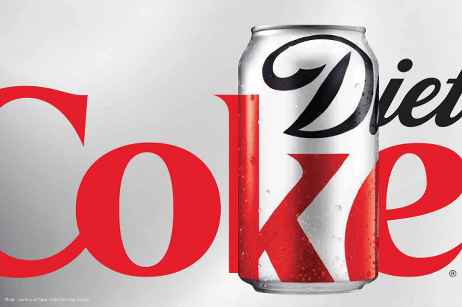
I've noticed a trend lately toward minimalist brand communication on packaging. The most recent example is a limited edition Diet Coke® can (designed as more of a fashion statement than anything, perhaps) that utilizes just a small portion of the logo, enlarged to fill the entire face of the container. You can't actually read "Diet Coke," but everyone knows it's Diet Coke by the familiar font and color treatment we've all seen thousands of times. (See package #1.)
Starbucks® has simplified its brand as well (on cups, specifically) by eliminating the Starbucks Coffee name, and depicting only the well-known, crowned mermaid icon. (See package #2.)
And in my last example, Gatorade® strips everything away on its product label except for a large "G" overlaid with the graphic lightning bolt. (See package #3.)
What's the point of doing this? And more importantly, does it help or hurt a brand?
The reason for stripping a brand identity down to its bare essence is straightforward -- simplicity. As we're bombarded with more and more brand messaging every day, it's easier to communicate with symbols and icons (or pieces of a brand in our examples) than with words or phrases. For example, which communicates faster: a picture of an apple or the word "apple"? As in the world of texting, in which a couple of letters communicate an entire word or phrase, so can a portion of a logo represent a complete brand. Our mind does the work of completing the picture if, and this is a BIG IF, the brand is well enough known.
If you're not as ubiquitous as Diet Coke, Starbucks, or Gatorade, however, a stripped-down logo can be risky. Even for a megabrand like Gatorade, sales were down initially after the package change because the design strayed a little too far from the familiar logo.
As the nation's leading agency in the practice of positioning, we would not only ask, "Is the simplification of a package design or logo practical?" but, "How does it affect your brand positioning identity?" Since a brand can only be known for "one thing," does the new design affect that "one thing"? Does the bold "G" with the lightning bolt support Gatorade's brand position of "leading athletic energy drink"? (I think so.) Is the "wordless mermaid" icon in harmony with the experiential, feel-good attitude of Starbuck's brand position and familiar identity? (Again, I think yes.)
Since all of the examples shown here are category leaders, their brands and brand positions are familiar enough that a graphic simplification doesn't hurt them. In fact, as leaders, I would say they're expected to be the innovators of design, as long as they don't risk the integrity of the brand.
How about your brand look? Do you know what your brand positioning identity is? Does it have some clutter that could be simplified for a more dynamic look or easier readability? If you're not a well-known megabrand, be careful not to go to extremes. Sometimes the bare essence of a brand can give it new life.
Jeff Monter is Innis Maggiore's Principal Creative Services.