If you’re a consumer product manufacturer, you’ve undoubtedly marketed your product through a variety of advertising, media, and PR tactics. But have you considered how you might be able to boost sales and elevate your product image with branded packaging design that aligns with your company’s position? By simply enhancing the design of your product package, it’s possible to improve shelf appeal, create stronger customer loyalty, and raise pricing because of a higher perceived value.
If you follow our PositionistView® blogs, you are well aware of the importance we place on positioning — the philosophy that a brand can only stand for one idea in the mind of a consumer. Master marketers utilize positioning every day to cement that one idea into customers’ heads with the goal of creating “brand equivalence,” which means the brand name and the idea are thought of interchangeably. For instance, Google = Search. In fact, most people now say, “I’m going to Google this,” rather than, “I’m going to search for this term.” Or “will you Xerox this document for me?” instead of “will you copy this document for me?”
As a product manufacturer, think about ways you might change up your branded packaging design to create a closer tie to your brand’s position. For example, if you sell a diet product, is your package slender and ergonomic with clean, uncluttered graphics, or is it simply a generic-looking label slapped on a box or bottle? The visual shape, design, color, and even texture of a package can influence a customer’s perception of your brand.
Below is a list of design features to consider as you develop your product packaging, along with several visual examples. By incorporating ideas like these, it’s likely you’ll boost the power of your marketing initiatives.
Shape – Incorporate an engaging shape into your package design to align with the physical characteristics of the product or the positioning idea of your brand. This can help capture customers’ attention on the store shelf and even improve the experience of using the product, ensuring repeat purchases.
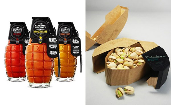
Example 1: The General’s Hot Sauce brand does a phenomenal job of instantly connecting the idea of a blast of heat from the product with the grenade-shaped bottle.
Example 2: This New Zealand package design concept for pistachios ingeniously houses the product in a container that literally opens the way you would separate the shell.
Graphics – If the cost of engineering a uniquely-shaped package is prohibitive, eye-catching graphics are a way to compensate for that design technique. Again, be sure to match the graphic design style with the position of your brand to make the connection unmistakable.
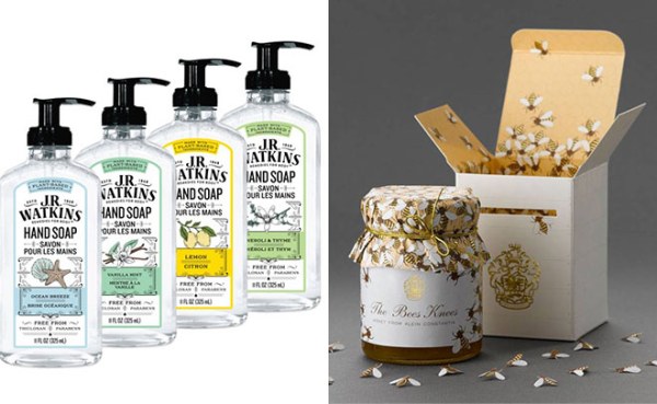
Example 3: All of J.R. Watkins products have the instantly recognizable, old-fashioned graphic look that perfectly connects to the brand’s heritage position.
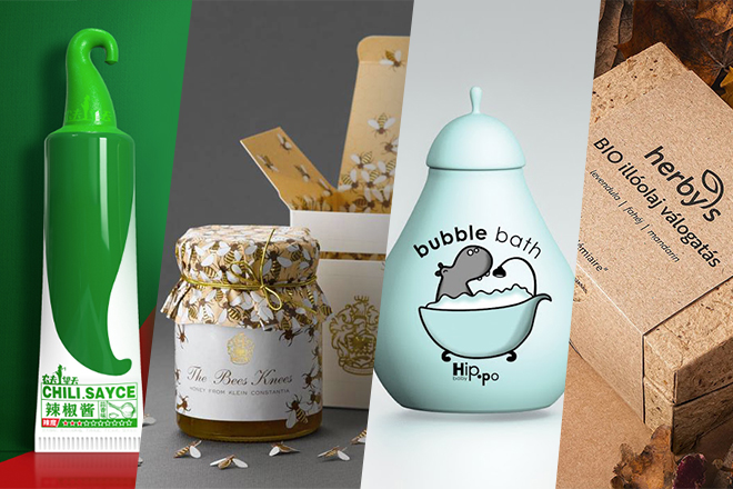
Example 4: This gorgeous package design of The Bees Knees Honey starts with a clever box that looks like a beekeeper’s hive and keeps enticing you as you open it to reveal images of bees, a beautiful parchment-wrapped jar enhanced with a gold tie and foil logo. A design that makes you want to pick the product up and not mind paying more for.
Texture – The sense of touch is a subtle but powerful motivator that can persuade people to purchase your product. By matching the tactile nature of a branded packaging design with the contents or product benefit, you reinforce the brand’s position. Package raw materials, embossing, and special coatings are ways to achieve texture in your package design.
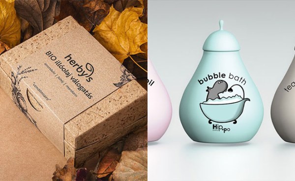
Example 5: This package design concept for Herbys essential oils does a marvelous job of using texture and natural colors to suggest the organic nature of its products. The product/package connection persuades you to believe the brand’s benefit claims.
Example 6: This adorable package design concept for Hip-Po baby bath products is designed with an ultra-soft texture that feels as soft as baby skin following a bath, a perfect correlation between the product and the benefit.
Functionality – Think about how your product is used, stored, or displayed at shelf. Is the package designed to make these interactions easy, sensible, or fun? Even a great product can be enhanced with some additional package engineering to make it more functional.
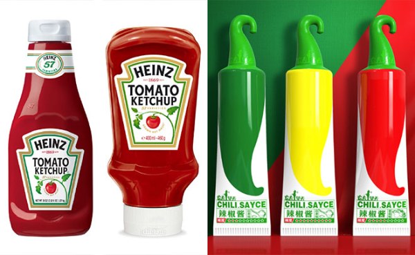
Example 7: Heinz has done a remarkable job over the years to portray its position as the thick, rich ketchup we all know and love. The Carly Simon song “Anticipation” was used for years to demonstrate the patience it took to pour the product from the familiar-shaped bottle. And Heinz also realized that some people, (like me) don’t have the patience to wait for the ketchup to come out of the bottle, so they created the “upside-down” package with the lid at the bottom for a common-sense, functional enhancement of this already-great product.
Example 8: This cleverly designed chili sauce package from China utilizes a lid and handle that looks like the stem of the pepper it was made from, making it easy to display in stores. The bright colors and simple graphics add to the appeal of this product.
If you’re interested in boosting your sales by making enhancements to your branded packaging design, our expert team of designers (who are also well-versed in the power of positioning) are ready to create something extraordinary for you. Click here to learn more.

