As the "resident expert" on logo design at the nation's leading agency in the practice of positioning, I was asked to provide a critique on the new Big Ten logo created by international design firm Pentagram. But first, I'd like to critique all the logo critics out there who seem to think: a) they're all master logo designers, b) logo design is easy, and c) even though they didn't pay for the new Big Ten logo, their opinions should persuade the organization to change it to match their ideas of the perfect look.
It's amazing how society is becoming more cynical, sarcastic, and mean-spirited, even toward things that really don't affect it. The recent rantings about the new Big Ten logo and other brand creative are good examples.
Most people have no idea about the process of logo design ... the client input, the parameters, how it will be used, committee approval processes, etc.
For instance, let's look at some of the possible parameters the designers had to consider for the new Big Ten logo:
-
- It must be general enough to represent every sport in every athletic department of all 12 schools.
- The new Big Ten logo must be simple, bold, and readable enough to be used in a multitude of applications ranging from a 50-foot banner to a ½-inch lapel pin.
- Committees from all 12 schools must approve it. (Good luck with that one!)
Not an easy task.
Now that I have that off my chest, let's move on to the things I like and dislike about the new Big Ten logo.
Likes:
-
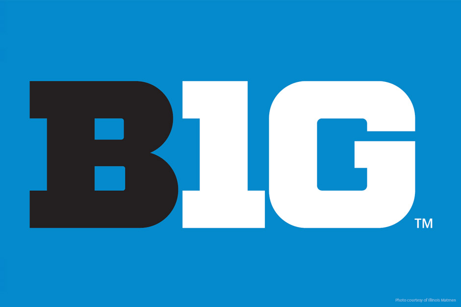
- The new Big Ten logo is definitely easy to read.
-
- The heavy serif font is reminiscent of the legendary "letters" athletes sewed onto their school jackets. And since the two conferences within the league are being renamed, "Legends" and "Leaders," it fits the theme.
-
- The "clever" creation of the number 10 depicted in the "I" and "G" in the word "BIG." (It's easy to see in the black and blue version.) I had to laugh when one critic asked why the designer used a lowercase "L" instead of a capital "I." It's actually a numeral "1." Someone should ask why she has a capital "L" on her forehead! (Oops, the sarcasm is contagious.)
Dislikes:
-
- The baby blue color of the new Big Ten logo is weak for a powerhouse athletic organization.
-
- The design firm didn't find a way to subtly incorporate the number of teams in the league. The old Big Ten logo snuck in the number 11 in the negative space — a very nice touch.
-
- Although it fits all the parameters, it's just not very exciting. I think there could have been a way to add a little jazz without complicating it.
So, my final grade for the new Big Ten logo? I'd give it a C+.
By the way, check out the old Pac-10 logo for comparison. Gee, I wonder why they used a lowercase "a"?
Jeff Monter is Innis Maggiore's Principal Creative Services.


