

There has been a lot of talk, by marketing experts and consumers alike, about the debacle of Tropicana's new packaging and brand creative.
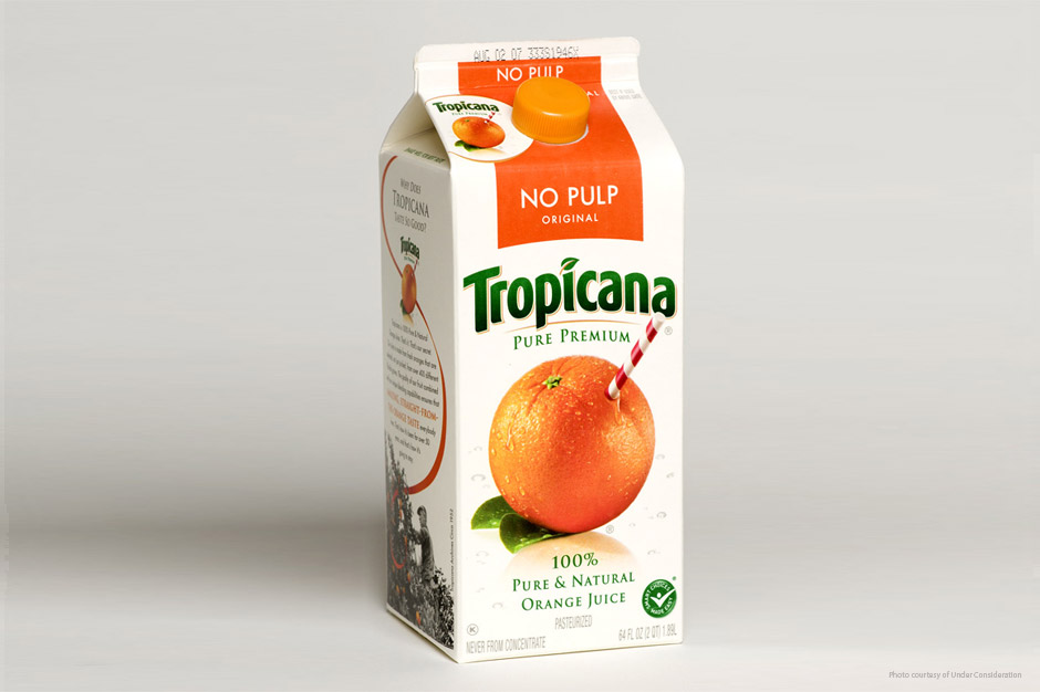
In case you didn't know (because of how swiftly it disappeared from stores), the orange juice giant changed their product packaging from the perennial concentration (pardon the pun) on the image of the straw sticking out of an orange to a graphic they felt was a bit "juicier."
(Click here to compare the old and new packaging.)
While many of the pundits and the bloggers have been bogged down with a lot of left brain vs. right brain talk or complicated theorizing, it's easy to assail Tropicana's new marketing much more simply.
In fact, only two things matter:
-
- Tropicana's traditional ownership of the "not-from-concentrate" segment in the consumer's mind.
- That PepsiCo was the source of this new strategy (that is before they backtracked and committed to returning to the original packaging graphics.
We know how well Tropicana grabbed and indeed owned the "not-from-concentrate" position.
The packaging was a great dramatization of that positioning - to the point that the basic approach has remained the same over many years, with only secondary stylistic differences.
PepsiCo has owned the brand since 1998, and I'm surprised it took them so long to do something totally stupid with it.
When they changed the packaging, they essentially let go of the positioning they owned. It's gone and they gave it up without a fight.
An original Tropicana person - someone who would have worked hard to help create, strengthen, and protect what made Tropicana different - would not have been so careless.
But someone with no connection or history - or someone acquiring merely a brand name - might. Consolidation has often had this type of unintended consequence... though not always as obvious.
My main beef with many pundit's main premise is attributing the mistake to someone wanting to be "too creative" with the new packaging and ads. I don't agree.
You couldn't be more creative than the original concept. The brand creative - the straw in the orange - so clearly demonstrates the positioning that I'd say it represents the height of creativity.
The brand creative may have grown too familiar over the years. But just because it isn't new doesn't mean it isn't creative.
Taking that degree of creativity for granted was the mistake. The new brand creative is in no way emblematic of anything. It's attractive, I guess. It's non-threatening. But still pretty milquetoast.
It's really just generic, and not at all creative.
As for the ad (click here to view), that's not creative either. It's just stupid. It has nothing to do with the product and could be an ad for anything.
The root of the mistake lies with the strategy, not in its brand creative. The idea of PepsiCo changing all of its brands' creative - whether they need to be changed or not - is simply stupid. And there's nothing creative about that.
It's not left brain vs. right brain; it's just no brain.