
Or, does your brand positioning affect the colors you choose to represent it? The answer should be a resolute "yes" to both questions! Can you imagine drinking a bottle of Coke imprinted with a blue label rather than the familiar red and white? What if you pulled into a BP station and the green and yellow signage was replaced with one that was orange and black? We don't often think about it, but color can have a huge psychological impact on the decisions we make about brands. About whether or not we'll purchase a product, or try a service, or believe a message.
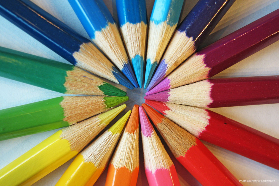
Below is a brief overview of what certain colors mean and the emotions they convey. Following that, we'll take a look at how those descriptions can impact your brand image and position.
Black: Authority. Power. Stability. Strength.
White: Purity. Cleanliness. Safety.
Gray: Practicality. Timelessness. Neutrality.
Red: Energy. Excitement. Attention-getting. Boldness.
Blue: Calmness. Restfulness. Dependability. Loyalty.
Green: Growth. Nature. Peacefulness. Harmony.
Yellow: Cheerfulness. Optimism. Playfulness. Intensity.
Orange: Flamboyancy. Energy. Warmth. Ambition.
Purple: Prosperity. Royalty. Sophistication.
Brown: Reliability. Stability. Friendliness.
Okay, back to the Coke bottle. As you can see by the descriptions above, the brand is represented perfectly by the colors red and white - a bold, clean, pure taste that provides energy and excitement. Your mind makes the connection and you find it logical and believable. Same with BP. The image they want to convey is optimism and being in harmony with nature. The green and yellow brand suggests that nicely. Let's take a look at the Volvo brand. They use silver (gray) and blue in their logo. Practicality, timelessness, dependability and loyalty are all attributes that certainly align with their position of safety. Would you believe them if their logo was bright red?
What about your position?
If your company is a financial institution and your brand position is all about safe, conservative investing, you wouldn't use orange in your logo or office décor. But what if you are a hip, cutting-edge software company? Orange, combined with a red, yellow, green or black would be appropriate for your brand image. If you represent a retail establishment, red would seem to be the obvious choice for signage to attract attention (just drive around town and look at all the red signs.) But with all the clutter now, it's possible that another strong color would stand out among the sea of red. Choose a color that best represents your brand personality. And if it is red, find a way to show it in a more unique way or in a combination with another color.
The key in color selection starts with your position. Your position has to align with your brand personality. And your brand personality will suggest the range of colors which will identify your operation, from your corporate identity to your advertising.
Jeff Monter is Innis Maggiore's Principal Creative Services.