


The Skinny on Diet Pepsi's New Can
After nearly two years of marketing dormancy, Diet Pepsi is introducing a new package for the brand -- the skinny can -- to reacquaint itself with current customers and entice new ones to try the product. But, in doing so, the company has also ignited a controversy from eating disorder associations that are offended by the idea that Diet Pepsi is "celebrating" skinny. So, what does all this mean to Diet Pepsi's brand position?
Let's first look at the brand position logic with the launch of the new can, then we'll discuss the controversy. Can the shape of a package affect a company's brand position? Absolutely! The package of any product is an extremely important part of the essence of any brand. The graphics, the texture, the packaging material, and, yes, even the shape of the package help to create a perception about a product and differentiate that product from the competition.
If a package is unique, user-friendly and attractive, it can have a huge impact on how customers accept or reject a product and its overall brand position. A few that come to mind are L'eggs pantyhose in the famous egg-shaped container, Absolut Vodka's clear, simple bottle that's been featured in its ads for years, and the iconic, ubiquitous Coke bottle. All you have to do is mention those brand names and an image of their package, as well as a perception of that brand, pops into your head.
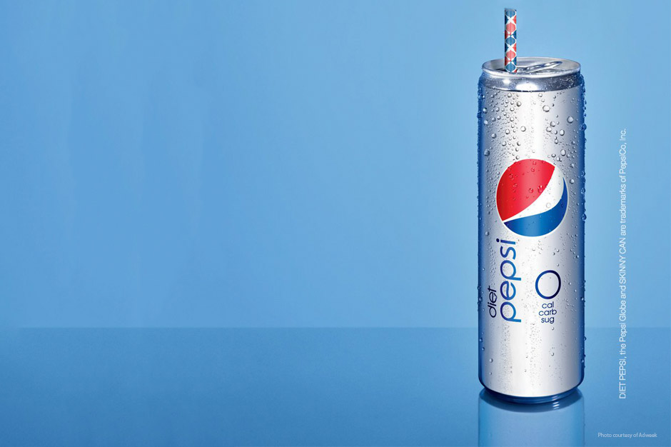
Back to Diet Pepsi's new package -- is it unique, user-friendly and attractive? One could argue yes on all three accounts. The slender shape certainly suggests the benefits of a low-calorie diet drink and the taller size makes it stand out on the shelf. Even the simple graphics make it easy to identify. Taking those items into account, I think the new can does a good job of suggesting and personifying Diet Pepsi's brand position, the goal of any successful brand.
So, why the public backlash at the recent unveiling of the new package? I think if the skinny can was the original package that Diet Pepsi was launched in, there would be no controversy because there would be nothing to compare it to. But since a perception of a brand (the brand position) becomes so engraved in a consumer's mind, people struggle with the change. And they'll come up with all sorts of reasons why it shouldn't change -- it won't fit in vending machines, the contents will become warmer faster due to increased surface area, it's offensive to overweight people, etc.
These criticisms may all be true, but I doubt any of them would be issues if the skinny can was Diet Pepsi's inaugural package. (I can only imagine consumers' gripes about Coke's hourglass-shaped package if it was newly introduced as a follow-up to a more standard-shaped bottle.)
Changes to the familiar make people uncomfortable, which is evident by recent package and logo changes by Tropicana and Gap. Negative reactions to packaging changes also prove that brand positioning is a very powerful element of marketing.
Check out some other interesting (and lesser-known) package designs that suggest the brand position or product feature.
Babee's Honey
Sweet's Taffy
Niagara Spring Water
Lagosta Wine
Jeff Monter is Innis Maggiore's Principal Creative Services.